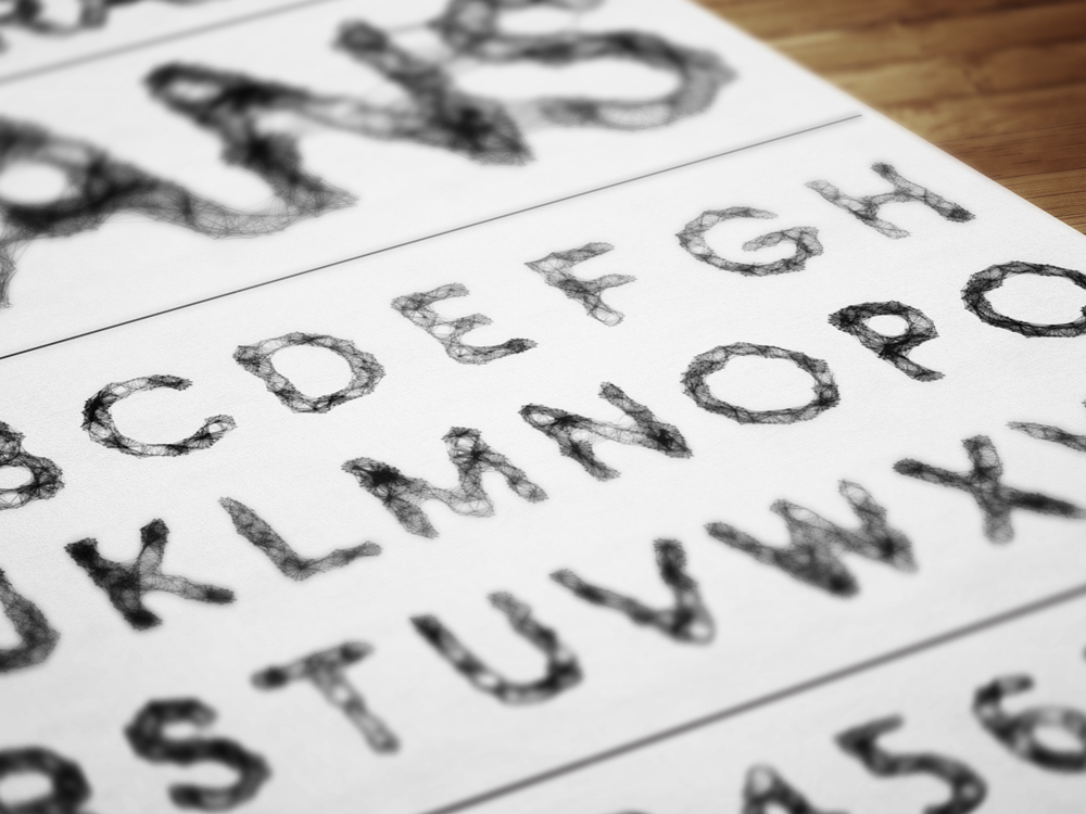
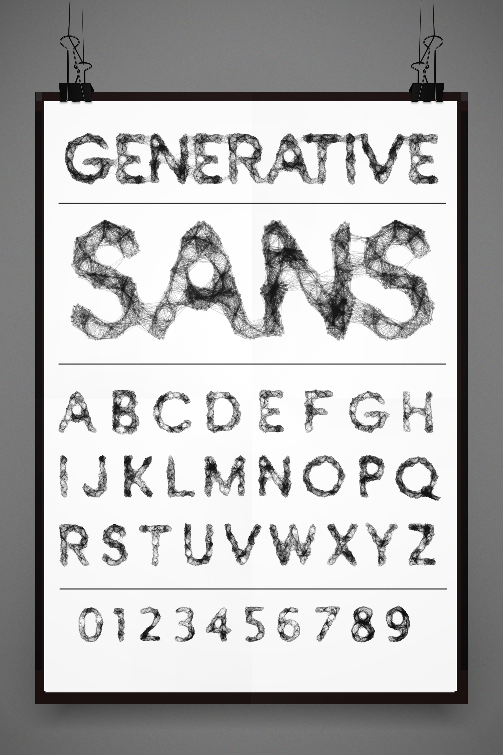
Generative Sans

In designing this typeface I wanted to hack what had gone before and define a new aesthetic with a complexity and future narrative that would open the possibilities of type with a versatility to be used as a display type in publishing and branding projects with the ability to generate custom ligatures joined strings of text for titles, headers and logo forms.
Beginning the project I researched the past and current developments in generative typography and while interesting strides had been made especially in the work of the highly acclaimed author of ‘The Art of Computer Programming’ which is listed by the American Scientist as one of the 12 best physical science monographs of the 20th century, Donald E. Knuth. His work on the development of the Metafont system which allowed for the generation of a new mathematical typography using it to create a new typeface for mathematics which he called ‘AMS Euler’ for the American Mathematical Society (AMS). While these developments took place is early eighties I felt the current offerings fell into two distinct categories the first is extremely experimental and expanded and bent the forms in an interesting and inventive manner however legibility was compromised in pursuit of this invention for example the ‘Alphabet Synthesis Machine’ created by Golan Levin with Jonathan Feinberg and Cassidy Curtis the characters formed where not intended to be read rather convey a concept.

The second more common generative type was too shackled to the geometry of the existing letter forms. Erik van Blokland and Just van Rossum’s typeface ‘Beowolf’, which is programmed with a randomizing algorithm that generates different outlines every time the font is used in different output applications, is an excellent example of this and while it was my goal to create a legible typeface it was clear that I would have to disrupt this initial geometry if it was to achieve the aesthetic I desired.
To create this altered form I wrote a processing sketch which would hack an open source san serif typeface replacing the vector data associated with the typeface and replace it with a randomized for of eclipses between 0 and 30 pixels (float r = random(0, 30);) this generated forms the could be manipulated and regenerated to produce a form that felt it would deliver the best available geometry while still retaining a strong sense legibility. From here a vector file pdf was created and brought in to adobe illustrator for refinement. At this stage the ellipses were all individually available to edit, through a process of trial and error I found different alterations pushing and pulling these elements to achieve the most desirable geometry for use in Fontlab and the subsequent generative sketch. The next step in the process was to use the pathfinder to create a closed vector path and scaled to a suitable scale for use Fontlab. Copying the forms from illustrator they were placed them into Fontlab and any open paths closed until the character was complete. This allowed me to export a beta version of the typeface which I labeled ‘CirleType’ and placed it in the data folder of the generative sketch.

The generative sketch in processing was designed to randomize the connection of a a set number points available in a defined distance. ‘Geomerative’ library by Ricard Marxer allowed for the breakdown of the typeforms previous generated and exported in true type format into a series of paths, handles and point that the sketch would use to construct the form. First passing single letters strings through the sketch a number of times to create variations of the form through a series of randomized connections, further refinements were made to the original letter forms in Fontlab and or illustrator depending of the severity if the changes needed. Once the alphabet was complete a layout of the letterform were placed in order to establish balance, evenness of of form and legibility. Further refinements and alterations were suggested, discussed and implemented with over fifty versions each form being created for consideration. The forms included in the final sample reflect the overall nature of the typeface but these form are ever evolving and should never be considered as a concrete form instead existing in a plastic state both mailable and reactive. The great American architect, Louis Sullivan, for whom Frank Lloyd Wright served as assistant for many years said that ‘Form follows function’ in this case it is the actual ‘function’ the creates the form.
In the book ‘ECAL: Typeface as Program’ the authors start with the simple question ‘is there such thing as a computer program capable of taking over the routine tasks of letter design?’. While my project does not completely replace the routine tasks of letter design it arrives at a new form and aesthetic that is legible, progressive, utilizes the power of the computer to create something that would not be conceivable using traditional digital techniques while still remaining in the control of the designer. Typography is based on the premiss of embedded experiences with every typeface possessing a narrative and it’s own voice and I feel i have created a typeface with a unique voice and one the defines a new narrative.